This handy Math in Focus Grade 6 Workbook Answer Key Chapter 13 Review Test detailed solutions for the textbook questions.
Math in Focus Grade 6 Course 1 B Chapter 13 Review Test Answer Key
Concepts and Skills
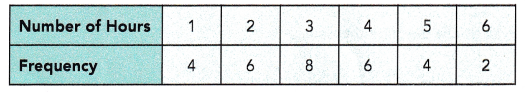
Copy and complete the table. Use the set of data.
Question 1.
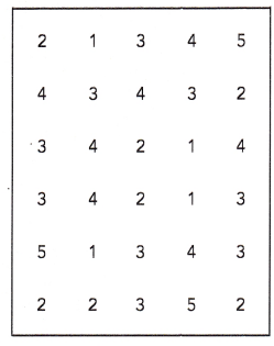
The number of bedrooms in the units of a new apartment building ranged from 1 to 5. The number of bedrooms in each unit is as follows:
Tabulate the data.
Answer:
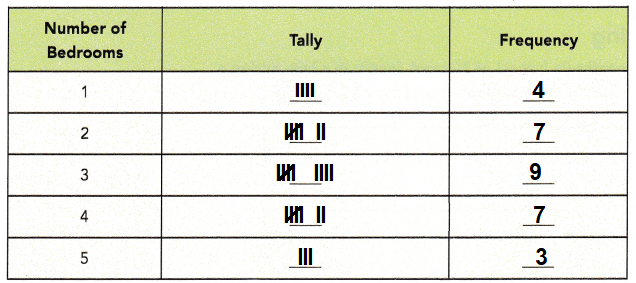
Explanation:
A Dataset is a set or collection of data.
This set is normally presented in a tabular pattern.
The number of bedrooms in the units of a new apartment building are marked in tally format.
The number of bedrooms in each unit is value noted in frequency in the above table.
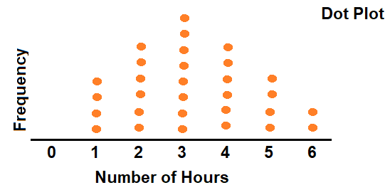
Draw a dot plot and a histogram for the set of data. Include a title.
Question 2.
The table below shows the number of hours 30 teachers in a school spent correcting students assignments.
Answer:
Dot plot for the given above table data,
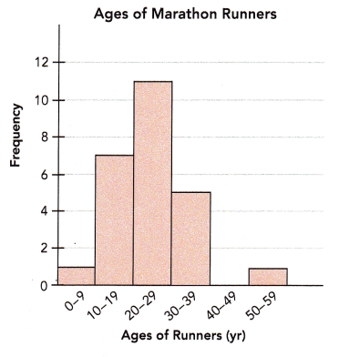
The histogram shows the ages of runners in a marathon. Use the histogram to answer questions 3 and 4.
Explanation:
Given the table below which shows the number of hours 30 teachers in a school spent correcting students assignments.
A dot plot is a graphical display of data using dots as shown below,
The histogram is a graphical display of data using bars of different heights.
In a histogram, each bar groups numbers into ranges.
Taller bars show that more data falls in that range.
The below histogram shows the ages of runners in a marathon.
Question 3.
How many data values are there?
Answer:
25
Explanation:
Given the table below which shows the number of hours 30 teachers in a school spent correcting students assignments.
0 to 9 = 1
10 to 19 = 7
20 to 29 = 11
30 to 39 = 5
40 to 49 = 0
50 to 59 = 1
1 + 7 + 11 + 5 + 0 + 1 = 25
Question 4.
Briefly describe the distribution including any outliers in the data.
Answer:
Yes, 11 is outlier.
Explanation:
Given the table below which shows the number of hours 30 teachers in a school spent correcting students assignments.
1, 1, 5, 11
average of 1,1 is 1
average of 5, 11 is 8
range of 1, 8 is 7
8 + 1.5(7) = 18.5
1 + 1.5(7) = 11.5
As, 11 is less then 11.5
So, 11 is outlier.
Outliers should be investigated carefully. Often they contain valuable information about the process under investigation or the data gathering and recording process.
Problem Solving
The data show the lengths (in inches) of 50 trout caught in a lake during a fishing competition. Use the data to answer questions 5 and 6.
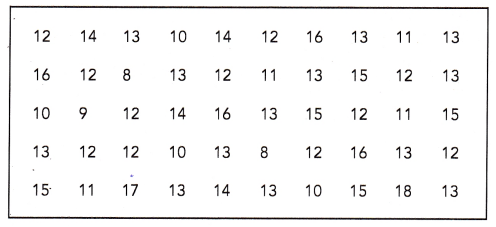
Question 5.
Group the data into suitable intervals and tabulate them. Explain your choice of interval.
Answer:
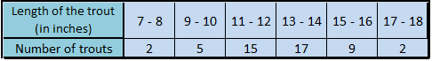
Explanation:
The above group of data is tabulated with an intervals of 2 inches difference, total 50 fishes are tabulated in the table as shown in the above figure.
The range is 18 – 8 = 10
Choosing an interval of 2 gives six intervals for the data set.
A larger interval will give too few intervals, and will not be able to see the distribution accurately.
Question 6.
Draw a histogram using the interval. Briefly describe the data.
Answer:
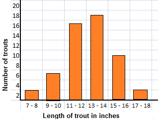
Explanation:
During a fishing competition different trots are caught in the lake.
The lengths (in inches) of 50 trout are tabulated in the table with different length intervals.
The range is 18 – 8 = 10
Choosing an interval of 2 gives six intervals for the data set.
A larger interval will give too few intervals, and will not be able to see the distribution accurately.
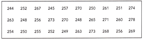
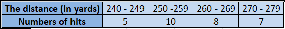
The data show the distances a golfer hits (in yards) in a long drive championship. Use the data to answer questions 7 and 8.
Question 7.
Group the data into suitable intervals and tabulate them. Explain your choice of interval.
Answer:
Explanation:
The above data show the distances a golfer hits (in yards) in a long drive championship are tabulated with an interval of 10 yards interval.
The range is 278 -240 = 33
Choosing an interval of 10 gives four intervals for the data set.
A larger interval will give too few intervals, and will not be able to see the distribution accurately.
Question 8.
Draw a histogram using the interval. Briefly describe the data.
Answer:
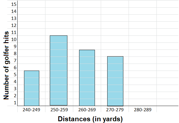
Explanation:
The above data show the distances of a golfer hits (in yards) in a long drive championship are tabulated with an interval of 10 yards interval.
In horizontal axis line distance and on vertical axis line number of hits are recorded.
The table shows the number of cars passing a traffic light during peak hours on a Friday morning. Use the data to answer questions 9 to 11.
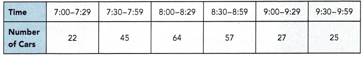
Question 9.
How many cars were observed altogether?
Answer:
Total 240 cars passing a traffic light during peak hours on a Friday morning.
Explanation:
At different time intervals cars passing a traffic light during peak hours on a Friday morning are tabulated in the table. The sum of all cars are as given below.
22 + 45 + 64 + 57 + 27 + 25 = 240
Total 240 cars passing a traffic light during peak hours on a Friday morning
Question 10.
Draw a histogram to display the data.
Answer:
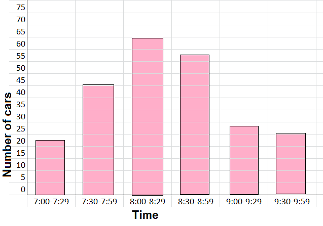
Explanation:
The above histogram shows time on horizontal line and number of cars on the vertical line.
At different time intervals cars passing a traffic light during peak hours on a Friday morning are tabulated in the table.
Total 240 cars passing a traffic light during peak hours on a Friday morning are shown in the above histogram diagram.
Question 11.
Describe the distribution of the data. Suggest why the histogram has the shape that it does.
Answer:
The distribution of a data set is the shape of the graph when all possible values are plotted on a frequency graph showing how often they occur.
Usually, we are not able to collect all the data.
Therefore we take a random sample.
This sample is used to make conclusions about the whole data set.
Explanation:
The above histogram shows time on horizontal line and number of cars on the vertical line.
At different time intervals cars passing a traffic light during peak hours on a Friday morning are tabulated in the table.
Total 240 cars passing a traffic light during peak hours on a Friday morning are shown in the above histogram diagram.
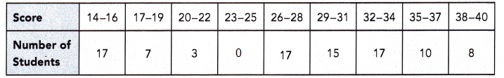
The quiz scores of 94 students are shown in the table. Use the data to answer questions 12 to 14.
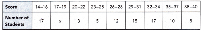
Question 12.
Find the value of x.
Answer:
x = 7
Explanation:
The given table shows the quiz scores of 94 students.
To find x, first find the sum of the number of students who scored in quiz.
17 + 3 + 5 + 12 + 15 + 17 + 10 + 8 + x = 94
87 + x = 94
x = 94 – 87
x = 7
Question 13.
Draw a histogram to represent the data. Describe the distribution of the data.
Answer:
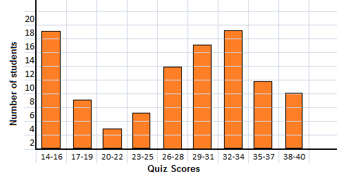
Explanation:
The distribution of a data set is the shape of the graph when all possible values are plotted on a frequency graph showing how often they occur in the above.
Usually, we are not able to collect all the data.
Therefore we take a random sample.
This sample is used to make conclusions about the whole data set.
Question 14.
If the 5 students who scored 23-25 all scored 26 instead, would this change where most of the data occur? Justify your answer.
Answer:
The changes of data table and the histogram is plotted for the changed values are shown in the below explanation.
Explanation:
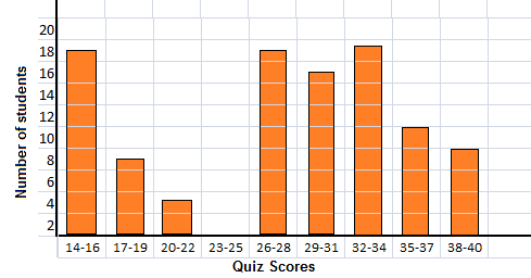
If the 5 students who scored 23-25 all scored 26 instead,
the value 5 in the 23-25 is shifted to 26-28 scores student, as shown below.