This handy Math in Focus Grade 6 Workbook Answer Key Chapter 13 Lesson 13.3 Histograms detailed solutions for the textbook questions.
Math in Focus Grade 6 Course 1 B Chapter 13 Lesson 13.3 Answer Key Histograms
Math in Focus Grade 6 Chapter 13 Lesson 13.3 Guided Practice Answer Key
Draw a histogram for each set of data.
Question 1.
In a study of the length of several individuals of one species of fish caught, the following observations were recorded. The lengths were measured to the nearest centimeter.
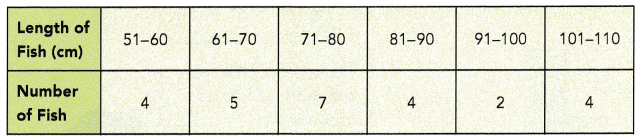
Answer:
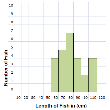
Explanation:
A histogram is an approximate representation of the distribution of numerical data.
As shown in the above table of data the fishes are of different lengths are graphically represented.
In statistics, a histogram is a graphical representation of the distribution of data.
The histogram is represented by a set of rectangles, adjacent to each other,
where each bar represent a kind of data.
Question 2.
The scores obtained by 40 students in a mathematics quiz are recorded in the table below.
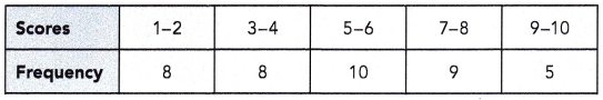
Answer:
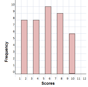
Explanation:
We know that in statistics, a histogram is a graphical representation of the distribution of data.
The histogram is represented by a set of rectangles, adjacent to each other,
where each bar represent a kind of data.
A histogram is an approximate representation of the distribution of numerical data.
As shown in the above table of data the scores obtained by 40 students in a mathematics quiz.
Draw a histogram for each set of data. Solve.
Question 3.
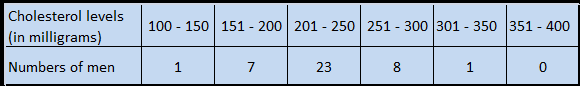
The cholesterol levels (in milligram per deciliter) of 40 men are listed below.
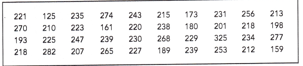
a) Group the data into suitable intervals and tabulate them. Explain your choice of intervals.
Answer:
Explanation:
Given that, The cholesterol levels (in milligram per deciliter) of 40 men are listed below.
The cholesterol levels (in milligram per deciliter) of 40 men are listed above table with an interval of 50 points.
As shown in the below table 100 – 150, 151 – 200 …… 351 – 400.
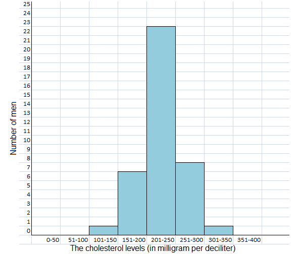
b) Draw a histogram using the interval.
Answer:
Explanation:
The histogram diagram for the cholesterol levels (in milligram per deciliter) of 40 men are listed above table with an interval of 50 points as 100 – 150, 151 – 200 …… 351 – 400 and,
minimum of 1 man and maximum of 23 men histogram are plotted in the above diagram.
Question 4.
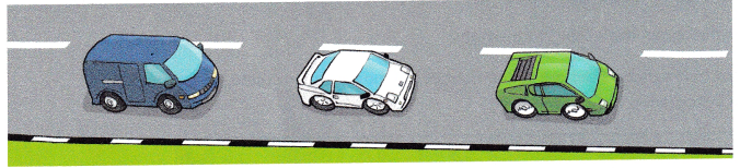
The speeds in kilometers per hour of 40 cars on a highway were recorded as follows.
a) Group the data into suitable intervals and tabulate them. Explain your choice of intervals.
Answer:
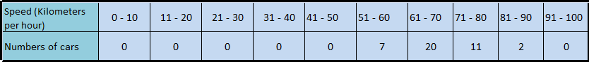
Explanation:
As we know that grouping data means the data given in the form of class intervals such as 0-10 to 91-100 as shown above.
Given that the speeds in kilometers per hour of 40 cars on a highway were recorded with an intervals of 10 kmph difference as shown in the above table.
b) Draw a histogram using the interval.
Answer:
Total 40 cars of different speed histogram diagram
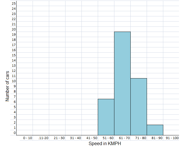
Explanation:
A histogram is a graphical representation of discrete or continuous data.
The area of a bar in a histogram is equal to the frequency.
The y -axis is plotted by frequency density and the x -axis is plotted with the range of values divided into intervals.
Given different care on highway with different speed is recorded in the table with different speed intervals as shown in the above histogram is plotted.
Describe the data.
Question 5.
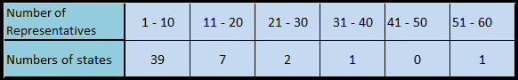
The histogram shows the number of representatives each state sent to the U.S. Congress in 2011. Briefly describe the data.
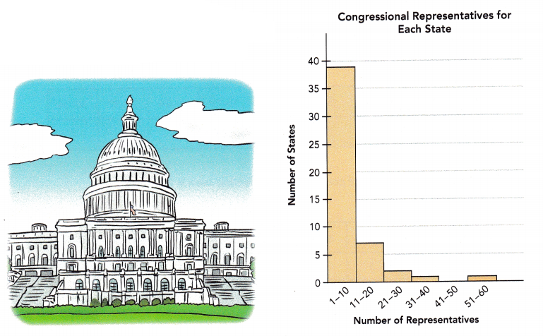
Answer:
Explanation:
The histogram shows the number of representatives each state sent to the U.S. Congress in 2011 describe the data in table form.
A histogram is a graphical representation of discrete or continuous data.
The y -axis is plotted by frequency density and the x -axis is plotted with the range of values divided into intervals.
The above table consists of Number of representatives and Number of states and the values with reference to the histogram is tabulated.
Question 6.
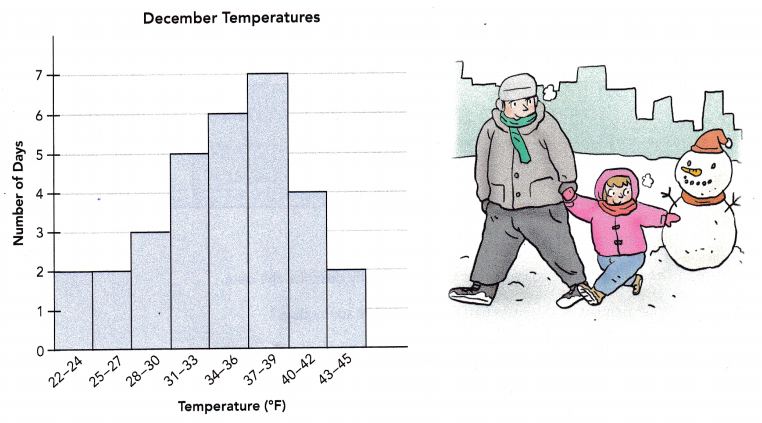
The histogram shows the highest temperature (in degrees Fahrenheit) recorded during December for one city. The temperature were recorded to the nearest degree. Briefly describe the data.
Answer:

Explanation:
The histogram shows the highest temperature (in degrees Fahrenheit) recorded during December for one city.
A histogram is a graphical representation of discrete or continuous data.
The area of a bar in a histogram is equal to the frequency.
The y -axis is plotted by frequency density and the x -axis is plotted with the range of values divided into intervals.
So, the temperature were recorded to the nearest degree.
The data is tabulated in the table format.
Math in Focus Course 1B Practice 13.3 Answer Key
Draw a histogram for each set of data. Include a title.
Question 1.
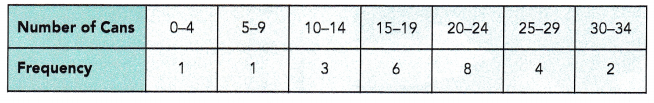
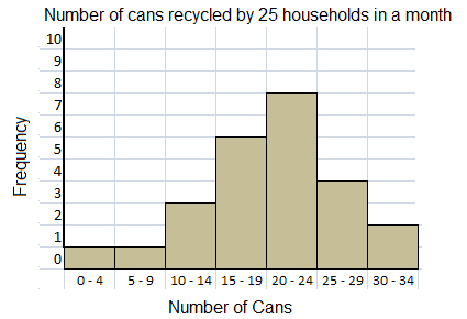
The table shows the number of cans recycled by 25 households in a month.
Answer:
Explanation:
The histogram shows the number of cans recycled by 25 households in a month, data given in the table format.
As we know the histogram is a graphical display of data using bars of different heights.
In a histogram, each bar groups numbers into ranges.
Taller bars show that more data falls in that range.
Question 2.
The table shows the number of points scored by a football team in 20 games of one season.
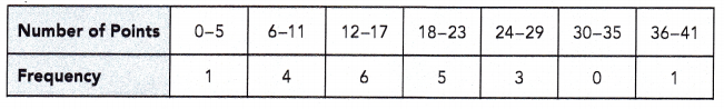
Answer:
Explanation:
The histogram shows the number of points scored by a football team in 20 games of one season.
As we know the histogram is a graphical display of data using bars of different heights.
In a histogram, each bar groups numbers into ranges.
Taller bars show that more data falls in that range.
Question 3.
The table shows the keyboarding speed of 100 students in a beginning keyboarding class.
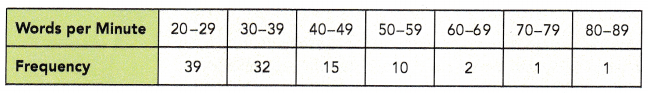
Answer:
Explanation:
The histogram shows the keyboarding speed of 100 students in a beginning keyboarding class.
As we know the histogram is a graphical display of data using bars of different heights.
In a histogram, each bar groups numbers into ranges.
Taller bars show that more data falls in that range.
Draw a histogram for the set of data. Include a title. Solve.
Question 4.
The number of sunny days in a year for 200 cities are shown in the table.
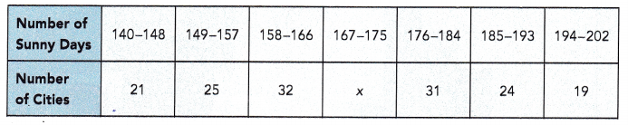
a) Find the value of x.
Answer:
48
Explanation:
The sum of the cities in the table are,
21 + 25 + 32 + 31 + 24 + 19 = 152
There must be 200 cities,
then 200 – 152 = 48
x = 48
b) Draw a histogram to represent the data. Briefly describe the data.
Answer:
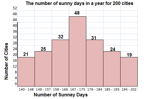
Explanation:
The histogram shows, the number of sunny days in a year for 200 cities.
As we know the histogram is a graphical display of data using bars of different heights.
In a histogram, each bar groups numbers into ranges.
Taller bars show that more data falls in that range.
c) What percent of the cities had fewer than 149 sunny days?
Answer:
10.5%
Explanation:
Total number of cities 200.
The number of cities had fewer than 149 sunny days = 21
The percent of the cities had fewer than 149 sunny days,
x = (21 / 200) X 100
x = 10.5%
d) What percent of the cities had more than 184 sunny days?
Answer:
21.5%
Explanation:
Total number of cities 200.
the number of cities had more than 184 sunny days,
24 + 19 = 43
The percent of the cities had more than 184 sunny days,
x = (43 / 200) X 100
x = 21.5%
The histogram shows the number of cars observed at one intersection at different times of the day. Use the histogram to answer questions 5 to 9.
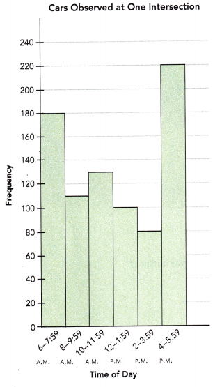
Question 5.
How many observations are there?
Answer:
820 observations at different time intervals.
Explanation:
Given that, the histogram shows the number of cars observed at one intersection at different times of the day.
As we know the histogram is a graphical display of data using bars of different heights.
In a histogram, each bar groups numbers into ranges.
Taller bars show that more data falls in that range.
Number of observations are as follows,
180 + 110 + 130 + 100 + 80 + 220 = 820
Question 6.
How many fewer cars passed the intersection from 6 A.M. to 7:59 A.M. than from 4 P.M. to 5:59 P.M.?
Answer:
40 observations.
Explanation:
Given that, the histogram shows the number of cars observed at one intersection at different times of the day.
cars passed the intersection from 6 A.M. to 7:59 A.M =180
cars passed the intersection from 4 P.M. to 5:59 P.M = 220
220 – 180 = 40
40 observations shows fewer cars passed the intersection from 6 A.M. to 7:59 A.M. than 4 P.M. to 5:59 P.M.
Question 7.
How many more cars passed the intersection from 10 A.M. to 11:59 A.M. than from 2 P.M. to 3:59 P.M.?
Answer:
50 cars.
Explanation:
Given that, the histogram shows the number of cars observed at one intersection at different times of the day.
cars passed the intersection from 10 A.M. to 11:59 A.M =130
cars passed the intersection from 2 P.M. to 3:59 P.M = 80
So, 130 – 80 = 50
50 cars passed the intersection from 10 A.M. to 11:59 A.M. than from 2 P.M. to 3:59 P.M.
Question 8.
What percent of the number of cars that passed the intersection from 4 P.M. to 5:59 P.M. was observed from 8 A.M. to 9:59 A.M.?
Answer:
50 percent of the number of cars that passed the intersection from 4 P.M. to 5:59 P.M. was observed from 8 A.M. to 9:59 A.M.
Explanation:
Given that, the histogram shows the number of cars observed at one intersection at different times of the day.
cars passed the intersection from 8 A.M. to 9:59 A.M =110
cars passed the intersection from 4 P.M. to 5:59 P.M = 220
220 – 110 = 110
110 / 220 = 0.5
0.5 x 100 = 50%
50 percent of the number of cars that passed the intersection from 4 P.M. to 5:59 P.M. was observed from 8 A.M. to 9:59 A.M.
Question 9.
What percent of the total number of cars that passed the intersection from 6 A.M. to 5:59 P.M. was observed from 4 P.M. to 5:59 P.M.? Round your answer to the nearest percent.
Answer:
73%
Explanation:
Given that, the histogram shows the number of cars observed at one intersection at different times of the day.
The total number of cars that passed the intersection from 6 A.M. to 5:59 P.M = 820
The total number of cars that passed the intersection from 4 P.M. to 5:59 P.M = 220
820 – 220 = 600
(600/820)X 100 = 73.17%
Round the answer to the nearest percent 73%
73% percent of the total number of cars that passed the intersection from 6 A.M. to 5:59 P.M. was observed from 4 P.M. to 5:59 P.M.
The histogram shows the number of books students in a class read last month. Use the histogram to answer the question.
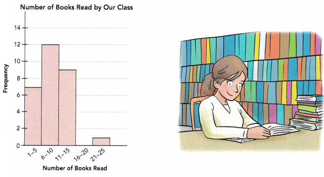
Question 10.
Briefly describe the data. Explain whether the histogram shows any outlier of the data set.
Answer:
Yes, 16- 20 books is outlier of the data set.
Explanation:
The above histogram shows the number of books students in a class read last month.
The gap of no books reading between 16 – 20.
An outlier is an observation that lies an abnormal distance from other values in a random sample from a population.
In a sense, this definition leaves it up to the analyst to decide what will be considered abnormal. Before abnormal observations can be singled out, it is necessary to characterize normal observations.
Draw a histogram for the set of data. Include a title. Solve.
Question 11.
The sales figures for 60 pairs of one style of shoe of various sizes at a department store are given in the table.
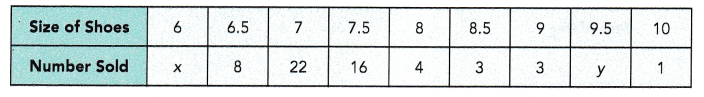
2 pairs of shoes of at least size 9.5 were sold.
a) Find the values of x and y.
Answer:
x = 1
y = 2
Explanation:
Given that the sales figures for 60 pairs of one style of shoe of various sizes at a department store are given in the above table.
The sales figures for 60 pairs of one style of shoe of various sizes are,
8 + 22 + 16 + 4 + 3 + 3 + 1 + x + y = 60
57 + x + y = 60
x + y = 60 – 57
x + y = 3
2 pairs of shoes of at least size 9.5 were sold.
y = 2
x + 2 = 3
x = 3 – 2 = 1
x = 1
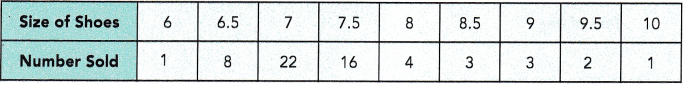
b) What fraction of the shoes sold are smaller than size 8?
Answer:
0.783
Explanation:
Given that the sales figures for 60 pairs of one style of shoe of various sizes at a department store are given in the table.
The shoes sold are smaller than size 8 = 1 + 8 + 22 + 16 = 47
Totals shoes sold are = 60
The fraction of the shoes sold are smaller than size 8.
47/60 = 0.783
c) Draw a histogram using the intervals 6-6.5, 7-7.5, 8-8.5, and so on. Briefly describe the data.
Answer:
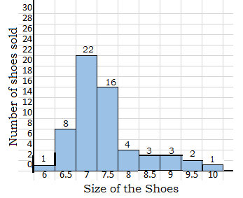
Explanation:
The histogram diagram shown above is the number of shoes sold of different sizes.
on vertical number of shoes sold and on horizontal line the sizes of the shoes sold.
As we know the histogram is a graphical display of data using bars of different heights.
In a histogram, each bar groups numbers into ranges.
Taller bars show that more data falls in that range.
d) If shoes were to be categorized as follows:
small – sizes 6 to 7; medium – sizes 7.5 to 8.5; large – sizes 9 to 10, draw a histogram for the above data using the new categories.
Answer:
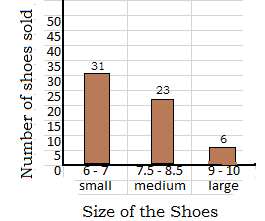
Explanation:
As we know the histogram is a graphical display of data using bars of different heights.
In a histogram, each bar groups numbers into ranges.
Taller bars show that more data falls in that range.
Given that the sales figures for 60 pairs of one style of shoe of various sizes at a department store are given in the table.
So, shoes were to be categorized as small – sizes 6 to 7; medium – sizes 7.5 to 8.5; large – sizes 9 to 10, and the quantities are added to total for small, medium and large.
Number of small shoes are 31
Number of medium shoes are 23
Number of large shoes are 6 pairs.
The total number of shoes are = 31 + 23 + 6 = 60
e) Compare the two histograms. When would each one be more useful?
Answer:
Both are useful,
for exact sale with reference to size first histogram are very useful.
second histogram tells about the small or medium or large size shoes are sold more or less in quantity.
Explanation:
Given that the sales figures for 60 pairs of one style of shoe of various sizes at a department store are given in the table.
for exact sale with reference to size first histogram are very useful.
second histogram tells about the small or medium or large size shoes are sold more or less in quantity as shoes were to be categorized as small – sizes 6 to 7; medium – sizes 7.5 to 8.5; large – sizes 9 to 10, and the quantities are added to total for small, medium and large.
Question 12.
Math Journal A survey was carried out to find the number of players who scored a certain number of goals during soccer matches in a month. A histogram was drawn to display the results.
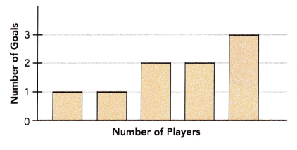
Is the histogram drawn correctly? Discuss with your partner and explain your thinking.
Answer:
The histogram is not drawn correctly.
Explanation:
As per the histogram diagram, a survey was carried out to find the number of players who scored a certain number of goals during soccer matches in a month.
No values in histogram are recorded on horizontal line.
Brain @ Work
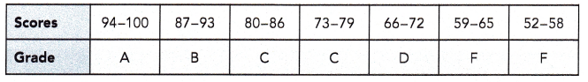
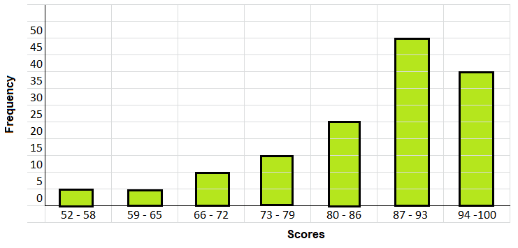
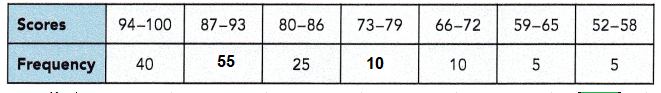
The table below shows the test scores for all the students in a Spanish I course.
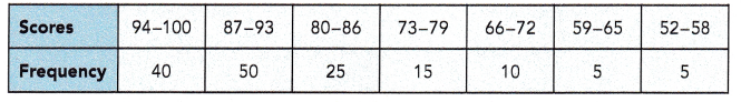
The following grades are used to represent the scores.
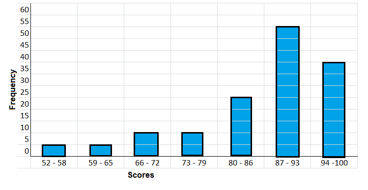
Question 1.
Draw a histogram to show the distribution of the scores.
Answer:
Explanation:
Based on the table below shows the test scores for all the students in a Spanish I course.
The above histogram on vertical line frequency is recorded and,
on the horizontal line scores are marked.
Bar graphs are plotted corresponding values given in the table.
Question 2.
Draw a bar graph to display the grades.
Answer:
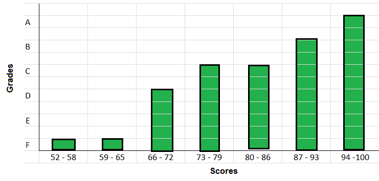
Explanation:
The following grades are used to represent the scores on histogram as shown above.
In the above histogram on vertical line Grades are marked and on the horizontal line scores are recorded.
Bar graphs are plotted corresponding grades given in the table.
Question 3.
Five students increased their scores from 79 to 89.
a) How would it change the histogram?
Answer:
Explanation:
In the above histogram on vertical line new frequency is recorded after shifting the five students from 79 to 89 scored students and on the horizontal line scores are marked.
Bar graphs are plotted corresponding values given in the table.
five students increased their scores from 79 to 89,
it means that subtract fives students from 73 – 79 and,
add it to 80 – 89 scores as shown in the above table.
b) How would it change the bar graph?
Answer:
Corresponding graph also will change accordingly as shown.
Explanation:
In the above histogram on vertical line new frequency is recorded after shifting the five students from 79 to 89 scored students and on the horizontal line scores are marked.
Bar graphs are plotted corresponding values given in the table.
Five students increased their scores from 79 to 89,
it means the subtract fives students from 73 – 79 and,
add it to 80 – 89 scores as shown in the above table.