This handy Math in Focus Grade 8 Workbook Answer Key Chapter 10 Lesson 10.1 Scatter Plots detailed solutions for the textbook questions.
Math in Focus Grade 8 Course 3 B Chapter 10 Lesson 10.1 Answer Key Scatter Plots
Math in Focus Grade 8 Chapter 10 Lesson 10.1 Guided Practice Answer Key
Use graph paper. Solve.
Question 1.
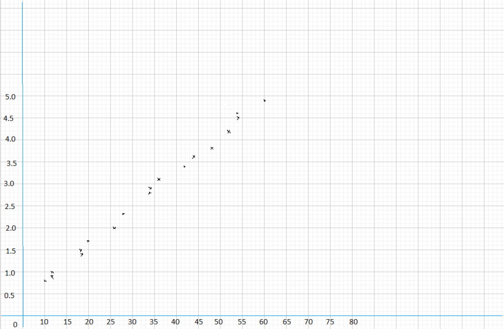
The table shows some monetary exchanges between U.S. dollars, x dollars, and Japanese yen, y yen, over a time period of 4 months at a major airport.
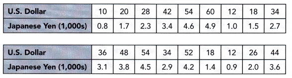
Construct a scatter plot for this data. Use 2 centimeters on the horizontal axis to represent $10. Use 2 centimeters on the vertical axis to represent 500 yen.
Answer:
Complete.
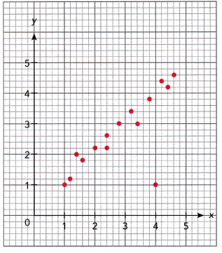
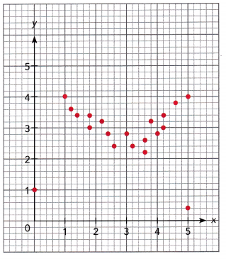
Question 2.
Describe the association between the bivariate data shown in each scatter plot.
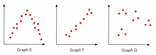
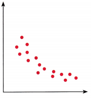
Graph E: ![]() and
and ![]() association
association
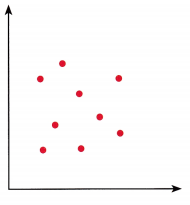
Graph F: ![]() ,
, ![]() , and
, and ![]() association
association
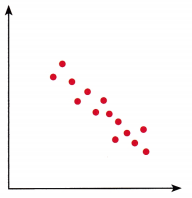
Graph G: ![]() association
association
Answer:
Graph E: strong and non-linear association
Graph F: Strong, Positive, and linear association
Graph G: No association
Use graph paper. Solve.
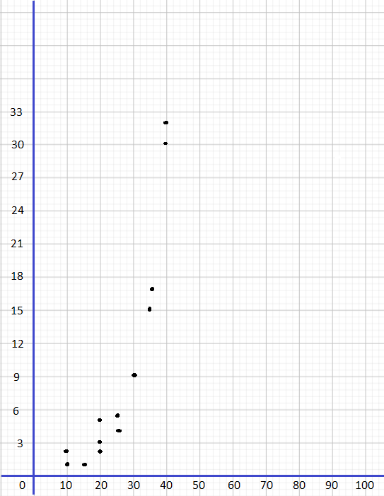
Question 3.
Dan is investigating the effect of the amount of water, x, given to tomato seedlings on their growth. He waters each of the 22 plants with a given amount of water daily. He records their height, y, at the end of two weeks. His data is shown below.
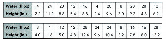
a) Construct a scatter plot for this data. Use 1 centimeter on the horizontal axis to represent 4 fluid ounce. Use 1 centimeter on the vertical axis to represent 1 inch. Identify any outlier(s).
An outlier appears to be located at (![]() ,
, ![]() ).
).
Answer:
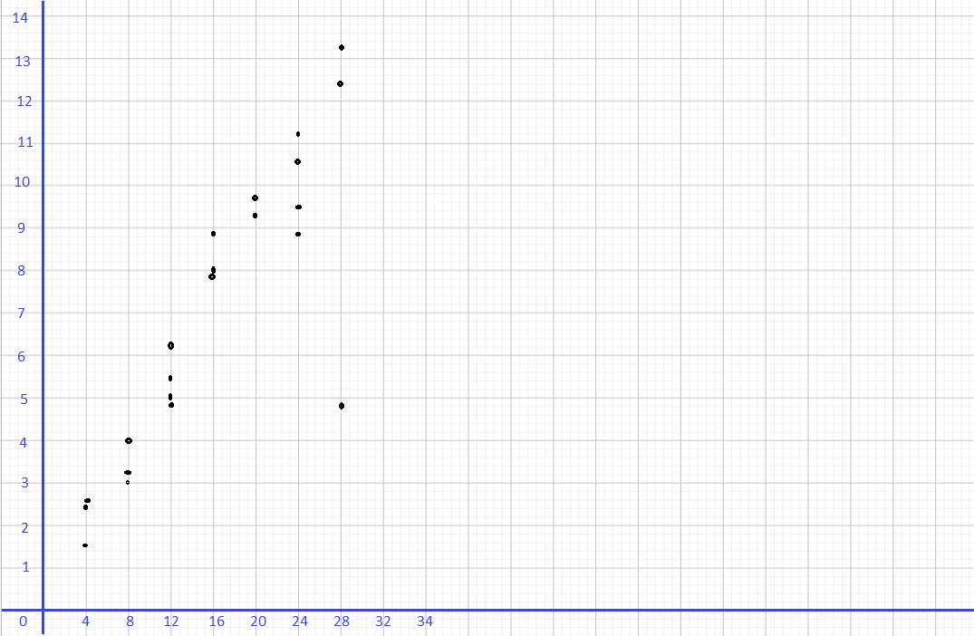
An outlier appears to be located at (28, 4.8).
b) Explain what the outlier(s) likely represent(s) in this context.
The outlier represents ![]() and
and ![]() after two weeks.
after two weeks.
Answer: The outlier represents 28 fluid ounces of water daily and a growth of 4.8 inches after two weeks.
c) Describe the meaning in context of the association between the two data sets. Validate the outliers as being very different from the rest of the data points.
The ![]() ,
, ![]() , and
, and ![]() association indicates that tomato seedlings that are given more water daily experience
association indicates that tomato seedlings that are given more water daily experience ![]() growth over the two weeks. The general trend shows that seedlings that are given 28 fluid ounces of water daily generally grew about
growth over the two weeks. The general trend shows that seedlings that are given 28 fluid ounces of water daily generally grew about ![]() inches, but the outlier represents a seedling that grew only
inches, but the outlier represents a seedling that grew only ![]() inches with
inches with ![]() fluid ounces of water daily.
fluid ounces of water daily.
Answer:
The strong, positive, and linear association indicates that tomato seedlings that are given more water daily experience more growth over the two weeks. The general trend shows that seedlings that are given 28 fluid ounces of water daily generally grew about 12 inches to 13 inches, but the outlier represents a seedling that grew only 4.8 inches with 28 fluid ounces of water daily.
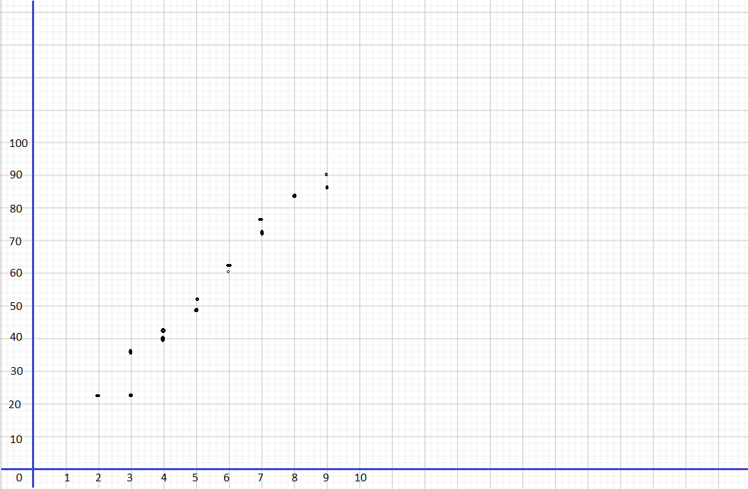
Math in Focus Course 3B Practice 10.1 Answer Key
Draw scatter plot for each of the given table of bivariate data.
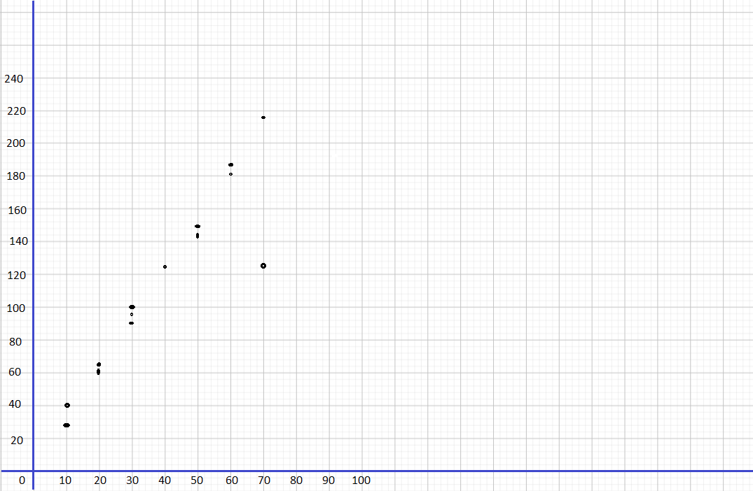
Question 1.
Use 1 centimeter on the horizontal axis to represent 10 units. Use 1 centimeter on the vertical axis to represent 20 units.
Answer:
Question 2.
Use 1 centimeter on the horizontal axis to represent 5,000 people. Use 2 centimeters on the vertical axis to represent 5,000 cars.
Answer:
Question 3.
Use 1 centimeter on the horizontal axis to represent 1 hour. Use 1 centimeter on the vertical axis to represent a score of 10.
Answer:
Describe the association between the bivariate data shown in each scatter plot.
Question 4.
Answer: Strong, linear and positive
Question 5.
Answer: Strong, linear and negative
Describe the association between the bivariate data shown in each scatter plot.
Question 6.
Answer: strong, nonlinear and positive
Question 7.
Answer: Strong, negative and nonlinear
Identify the outlier(s) in each scatter plot.
Question 8.
Answer: (1, 1) and (4, 1)
Question 9.
Answer: (0, 1) and (5, 0.4)
Use the table of bivariate data below to answer questions 10 to 13.
A retailer wanted to know the association between the number of items sold, y, and the number of salespeople, x, in a store. So she recorded the number of salesperson and items sold over 16 days in the table below.
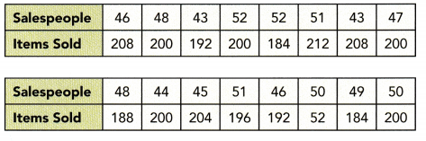
Question 10.
Use graph paper to construct the scatter plot. Use 1 centimeter on the horizontal axis to represent 1 salesperson for the x interval from 43 to 52. Use 1 centimeter on the vertical axis to represent 20 items.
Answer:
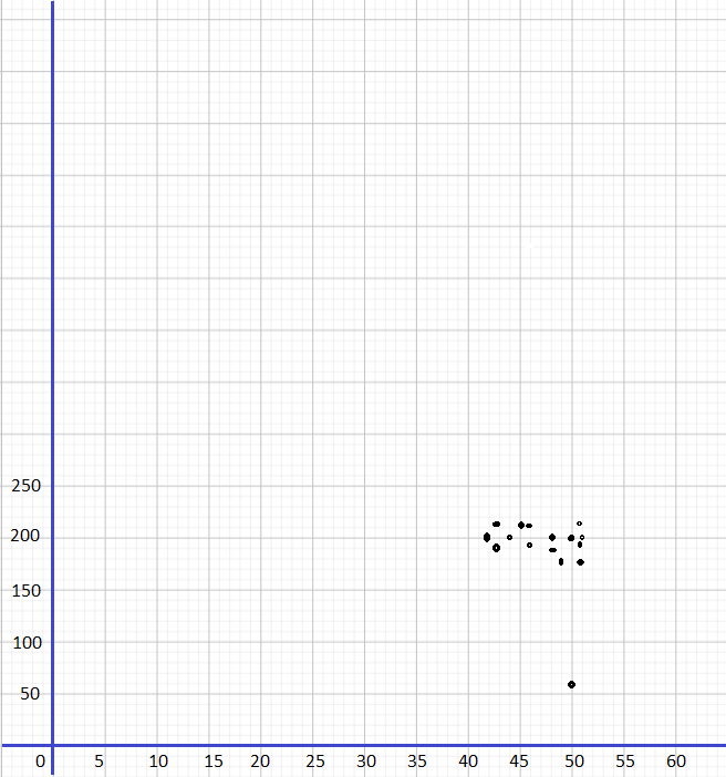
Question 11.
Identify the outlier. Give a likely explanation for the occurrence of the outlier.
Answer: (50, 52) because there could have been an accident or construction that blocked the access to the store for a long time that day.
Question 12.
Describe the association between the number of items sold and the number of salespeople in the store. Explain your answer.
Answer: The wide range of sampling values might be important when investigating the association between bivariate data
Question 13.
Math Journal If the data collected for the number of salespeople ranged from 0 to 100, do you think the answer to 12 would be different? Explain why a wide range of sampling values might be important when investigating the association between bivariate data.
Answer: If the association occurs over a greater range of values, then the narrow range if value might not be enough to identify the data.
Use the table of data below to answer questions 14 to 17.
To investigate the benefits of warming up before playing a baseball game, 14 amateur baseball players were surveyed. The number of game injuries, x, in a year and the time the player spent warming up for each game, y minutes, are recorded below.
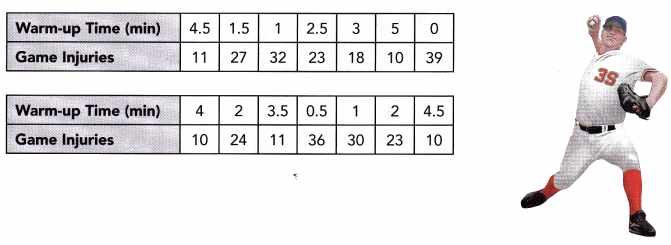
Question 14.
Use graph paper to construct the scatter plot. Use 2 centimeters on the horizontal axis to represent 1 minute. Use 1 centimeter on the vertical axis to represent 5 game injuries.
Answer:
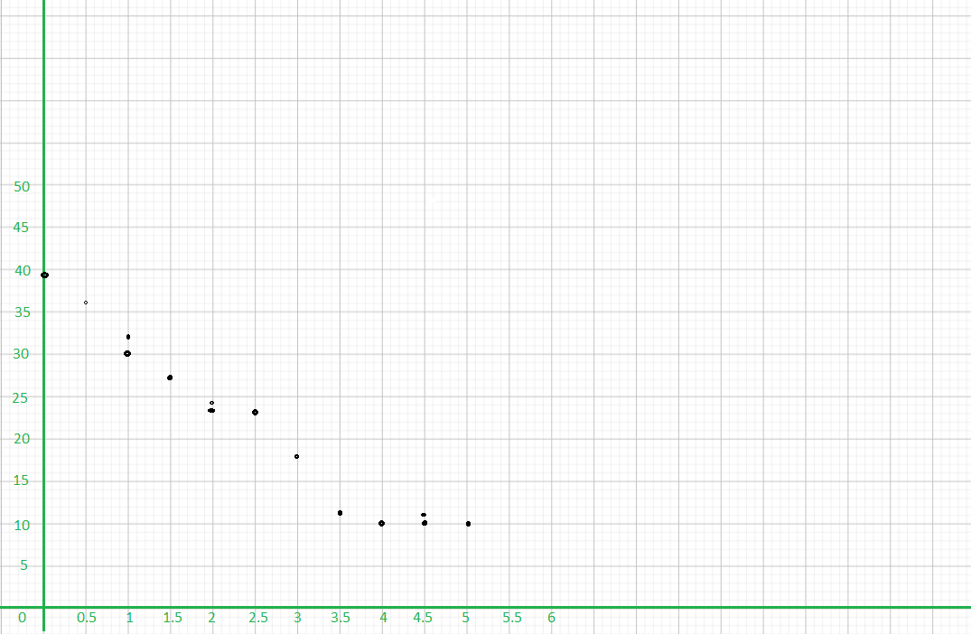
Question 15.
Identify any outliers.
Answer: no
Question 16.
Math journal Is there a linear association between the number of game injuries and the time spent warming up before each game? Explain.
Answer:
The task is to verify if there exist a linear association in the scatter plot for the number of game injuries and the time spent in warming up. If the scatter plot follows a straight line then it is linear, otherwise, it has a nonlinear association. Observe that there is a liner association in the scatter plot because as the time spent in warming up increases, the number of game injuries increases and thus the marks of these variables have a negative linear association
Question 17.
Math Journal From the results shown, can you recommend minimum : warm-up time for baseball players before they start a game? How does
analyzing association of data sets help to provide useful information?
Answer:
The target of this task is to give a suggestion about how long should the players warm-up, and then make a conclusion about the importance of studying the relationship of a group of data. Observe the scatter plot of the number of minutes players warm-up and the number of injuries. From 1 – 3 minutes, the behavior of data shows that as the time increases, the recorded injuries decreases. When the Length of warming up enters 4 the number of injuries are almost the same even at Longer warming-up time. Therefore, the shortest warming-up time is 4 minutes. A good analyzation of a group of data helps in making a good prediction.