This handy Math in Focus Grade 7 Workbook Answer Key Chapter 9 Lesson 9.3 Understanding Box Plots and Mean Absolute Deviation detailed solutions for the textbook questions.
Math in Focus Grade 7 Course 2 B Chapter 9 Lesson 9.3 Answer Key Understanding Box Plots and Mean Absolute Deviation
Math in Focus Grade 7 Chapter 9 Lesson 9.3 Guided Practice Answer Key
Solve.
Question 1.
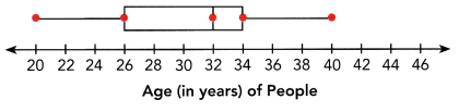
The box plot summarizes the age distribution of people in a play. State the lower quartile, the median, the upper quartile, the range, and the interquartile range.
Answer:
Quartiles divide the entire set into four equal parts. So, there are three quartiles, first, second and third represented by Q1, Q2 and Q3, respectively. Q2 is nothing but the median, since it indicates the position of the item in the list and thus, is a positional average. To find quartiles of a group of data, we have to arrange the data in ascending order.
In the median, we can measure the distribution with the help of lesser and higher quartile. Apart from mean and median, there are other measures in statistics, which can divide the data into specific equal parts. A median divides a series into two equal parts. We can partition values of a data set mainly into three different ways.
Quartiles formula:
Suppose, Q3 is the upper quartile is the median of the upper half of the data set. Whereas, Q1 is the lower quartile and median of the lower half of the data set. Q2 is the median. Consider, we have n number of items in a data set. Then the quartiles are given by;
Q1 = [(n+1)/4]th item
Q2 = [(n+1)/2]th item
Q3 = [3(n+1)/4]th item
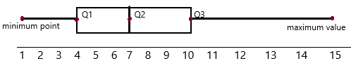
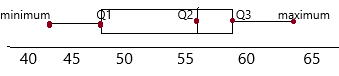
In the above-given diagram:
quartiles are given that we need to find out.
The first dot represents the minimum value: 20
The second dot represents the Q1 (lower quartile):26
The third dot represents the Q2 (median):32
The fourth dot represents Q3 (upper quartile):34
The fifth dot represents the maximum value: 40
Construct a box plot.
Question 2.
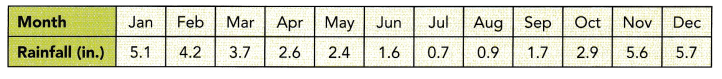
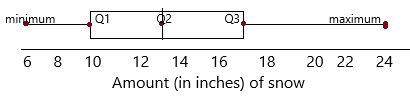
The table shows the average monthly precipitation of Portland, Oregon, in inches. Draw a box plot of the average monthly rainfall and label it with the 5-point summary.
STEP 1: Arrange the data in ascending order.
![]()
STEP 2: Calculate the 5-point summary.
Q1 = ![]() Q2 =
Q2 = ![]() Q3 =
Q3 = ![]()
Lower extreme value = ![]() Upper extreme value =
Upper extreme value = ![]()
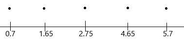
STEP 3: Draw a number line with a scale that covers both extreme values. Place a dot for each value from the 5-point summary.
STEP 4: Draw a box above the number line.
STEP 5: Draw the whiskers and label the box plot with the 5-point summary.
Answer:
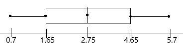
The above-given data: 5.1, 4.2, 3.7, 2.6, 2.4, 1.6, 0.7, 0.9, 1.7, 2.9, 5.6, 5.7
Now arrange in ascending order:
0.7, 0.9, 1.6, 1.7, 2.4, 2.6, 2.9, 3.7, 4.2, 5.1, 5.6, 5.7
The minimum point is 0.7
the second quartile Q2 is easy to find. It is the median of any data set and it divides an ordered data set into upper and lower halves.
Q2=2.6+2.9/2
Q2=5.5/2
Q2=2.75
The first quartile Q1 is the median of the lower half not including the value of Q2. The third quartile Q3 is the median of the upper half not including the value of Q2.
Q1 data set: 0.7, 0.9, 1.6, 1.7, 2.4, 2.6
Q1=1.6+1.7/2
Q1=3.3/2
Q1=1.65
Q1 is the median of the lower half of the data.
Q3 data set: 2.9, 3.7, 4.2, 5.1, 5.6, 5.7
Q3=4.2+5.1/2
Q3=9.3/2
Q3=4.65
Q3 is the median of the upper half of the data.
The maximum point is 5.7
Step 3:
Draw a number line with a scale that covers both extreme values. Place a dot for each value from the 5-point summary.
Step 4: Draw a box above the number line.
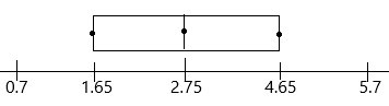
Step 5:
Draw the whiskers and label the box plot with the 5-point summary.
Average monthly rainfall.
Solve.
Question 3.
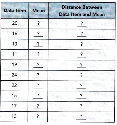
The scores on a math quiz are 20, 16, 13, 11, 19, 24, 22, 15, 17, and 13.
a) Find the mean absolute deviation.
STEP 1: Find the mean score.
Mean score = ![]()
STEP 2: Find the distance of each value from the mean.
STEP 3: Find the sum of the distances.
Sum = ![]()
STEP 4: Divide the sum by the number of data values to find the MAD.
MAD = ![]()
Answer:
Step 1: First we need to calculate mean
the given data: 20, 16, 13, 11, 19, 24, 22, 15, 17, and 13.
Mean=sum of observations/no.of observations
Mean=20+16+13+11+19+24+22+15+17+13/10
Mean=170/10
Mean=10
Step 2: Finding distance between each value
In statistics, the Mean Absolute Deviation (MAD) of the given data set value is defined as the average deviation between the mean and the data value. It describes the variation in the given data values. The procedure to find the mean absolute deviation is given below:
– Calculate the mean of the given data
– Determine the difference between each data value and the mean
– Now, take the absolute value of each obtained difference
– Finally, find the mean of these differences
|20-17|=3
|16-17|=1
|13-17|=4 Likewise, we need to subtract.
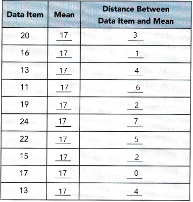
step 3: finding the sum of the above distances:
Sum=3+1+4+6+2+7+5+2+0+4
Sum=34
Step 4:
The formula for MAD:
The ratio of the sum of all absolute values of deviation from central measure to the total number of observations.
M.A. D = (Σ Absolute Values of Deviation from Central Measure) / (Total Number of Observations)
MAD=34/10
MAD=3.4
b) What does the mean absolute deviation tell you about this set of data?
Answer: On average, the data values are 3.4 units from the mean.
This gives us an idea about the deviation of the observations from the measure of central tendency.
Thus we can conclude that,
M.A.D=
Although to calculate mean absolute deviation, any measure of central tendency can be used out generally mean and median are the most common ones.
Technology Activity
Materials
- spreadsheet software
- two sets of 10 data values
USE SPREADSHEET SOFTWARE TO FIND MEAN ABSOLUTE DEVIATION
Work in pairs.
STEP 1: Enter 10 data values in one row of cells.
STEP 2: Choose a cell in a later row for the mean.
STEP 3: Use the spreadsheet software’s function for finding the mean to find the mean of the 10 data values.
See the screen shot below.
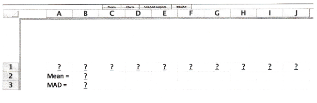
STEP 4: Choose a cell in the next row for the mean absolute deviation.
STEP 5: Use the spreadsheet software’s function for finding the mean absolute deviation to find the MAD of the data values.
STEP 6: Explain what the MAD tells you about the data.
STEP 7: Enter a second set of data values and repeat STEP 1 to STEP 6.
Math Journal Compare the two sets of data. Are the data values in each set clustered around the mean, or more spread out? Then compare the mean absolute deviations for the two sets of data. What do you observe?
Answer:
Math in Focus Course 2B Practice 9.3 Answer Key
State Q1, Q2, Q3 the lower extreme, and the upper extreme values shown in the box plots. Then calculate the interquartile range.
Question 1.
Answer:
Quartiles divide the entire set into four equal parts. So, there are three quartiles, first, second and third represented by Q1, Q2 and Q3, respectively. Q2 is nothing but the median, since it indicates the position of the item in the list and thus, is a positional average. To find quartiles of a group of data, we have to arrange the data in ascending order.
In the median, we can measure the distribution with the help of lesser and higher quartile. Apart from mean and median, there are other measures in statistics, which can divide the data into specific equal parts. A median divides a series into two equal parts. We can partition values of a data set mainly into three different ways.
Quartiles formula:
Suppose, Q3 is the upper quartile is the median of the upper half of the data set. Whereas, Q1 is the lower quartile and median of the lower half of the data set. Q2 is the median. Consider, we have n number of items in a data set. Then the quartiles are given by;
Q1 = [(n+1)/4]th item
Q2 = [(n+1)/2]th item
Q3 = [3(n+1)/4]th item
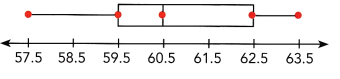
In the above-given diagram:
quartiles are given that we need to find out.
The first dot represents the minimum value: 57.5
The second dot represents the Q1 (lower quartile):59.5
The third dot represents the Q2 (median):60.5
The fourth dot represents Q3 (upper quartile):62.5
The fifth dot represents the maximum value: 63.5
Question 2.
Answer:
Quartiles divide the entire set into four equal parts. So, there are three quartiles, first, second and third represented by Q1, Q2 and Q3, respectively. Q2 is nothing but the median, since it indicates the position of the item in the list and thus, is a positional average. To find quartiles of a group of data, we have to arrange the data in ascending order.
In the median, we can measure the distribution with the help of lesser and higher quartile. Apart from mean and median, there are other measures in statistics, which can divide the data into specific equal parts. A median divides a series into two equal parts. We can partition values of a data set mainly into three different ways.
Quartiles formula:
Suppose, Q3 is the upper quartile is the median of the upper half of the data set. Whereas, Q1 is the lower quartile and median of the lower half of the data set. Q2 is the median. Consider, we have n number of items in a data set. Then the quartiles are given by;
Q1 = [(n+1)/4]th item
Q2 = [(n+1)/2]th item
Q3 = [3(n+1)/4]th item
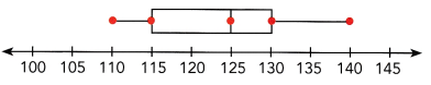
In the above-given diagram:
quartiles are given that we need to find out.
The first dot represents the minimum value: 110
The second dot represents the Q1 (lower quartile):115
The third dot represents the Q2 (median):125
The fourth dot represents Q3 (upper quartile):130
The fifth dot represents the maximum value: 140
Question 3.
Answer:
Quartiles divide the entire set into four equal parts. So, there are three quartiles, first, second and third represented by Q1, Q2 and Q3, respectively. Q2 is nothing but the median, since it indicates the position of the item in the list and thus, is a positional average. To find quartiles of a group of data, we have to arrange the data in ascending order.
In the median, we can measure the distribution with the help of lesser and higher quartile. Apart from mean and median, there are other measures in statistics, which can divide the data into specific equal parts. A median divides a series into two equal parts. We can partition values of a data set mainly into three different ways.
Quartiles formula:
Suppose, Q3 is the upper quartile is the median of the upper half of the data set. Whereas, Q1 is the lower quartile and median of the lower half of the data set. Q2 is the median. Consider, we have n number of items in a data set. Then the quartiles are given by;
Q1 = [(n+1)/4]th item
Q2 = [(n+1)/2]th item
Q3 = [3(n+1)/4]th item
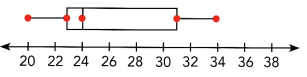
In the above-given diagram:
quartiles are given that we need to find out.
The first dot represents the minimum value: 20
The second dot represents the Q1 (lower quartile):23
The third dot represents the Q2 (median):24
The fourth dot represents Q3 (upper quartile):31
The fifth dot represents the maximum value: 34
Question 4.
Answer:
Quartiles divide the entire set into four equal parts. So, there are three quartiles, first, second and third represented by Q1, Q2 and Q3, respectively. Q2 is nothing but the median, since it indicates the position of the item in the list and thus, is a positional average. To find quartiles of a group of data, we have to arrange the data in ascending order.
In the median, we can measure the distribution with the help of lesser and higher quartile. Apart from mean and median, there are other measures in statistics, which can divide the data into specific equal parts. A median divides a series into two equal parts. We can partition values of a data set mainly into three different ways.
Quartiles formula:
Suppose, Q3 is the upper quartile is the median of the upper half of the data set. Whereas, Q1 is the lower quartile and median of the lower half of the data set. Q2 is the median. Consider, we have n number of items in a data set. Then the quartiles are given by;
Q1 = [(n+1)/4]th item
Q2 = [(n+1)/2]th item
Q3 = [3(n+1)/4]th item
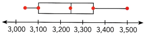
In the above-given diagram:
quartiles are given that we need to find out.
The first dot represents the minimum value: 3,050
The second dot represents the Q1 (lower quartile):3,100
The third dot represents the Q2 (median):3,250
The fourth dot represents Q3 (upper quartile):3,350
The fifth dot represents the maximum value: 3,500
Draw a box plot for the given 5-point summary. Include a numeric scale for the number line. Label the box plot with the 5-point summary.
Question 5.
Q1 = 4, Q2 = 7, Q3 = 10, lower extreme value = 1, upper extreme value = 15
Answer:
A box and whisker plot is a graph that exhibits data from a five-number summary, including one of the measures of central tendency. It does not display the distribution as accurately as a stem and leaf plot or histogram does. But, it is principally used to show whether a distribution is skewed or not and if there are potential unusual observations present in the data set, which are also called outliers. Boxplots are also very useful when huge numbers of data collections are involved or compared. Since the centre, spread and overall range are instantly apparent, using these boxplots the arrangements can be matched easily. A box and whisker plot is a way of compiling a set of data outlined on an interval scale. It is also used for descriptive data interpretation.
Elements of a Box and Whisker Plot:
The elements required to construct a box and whisker plot outliers are given below.
The minimum value (Q0 or 0th percentile)
The first quartile (Q1 or 25th percentile)
Median (Q2 or 50th percentile)
Third quartile (Q3 or 75th percentile)
The maximum value (Q4 or 100th percentile)
– When we plot a graph for the box plot, we outline a box from the first quartile to the third quartile. A vertical line that goes through the box is the median. The whiskers (small lines) go from each quartile towards the minimum or maximum value, as shown in the figure below.
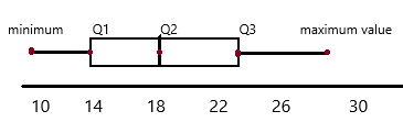
Question 6.
Q1 = 14, Q2 = 18, Q3 = 23, lower extreme value = 10, upper extreme value = 28
Answer:
A box and whisker plot is a graph that exhibits data from a five-number summary, including one of the measures of central tendency. It does not display the distribution as accurately as a stem and leaf plot or histogram does. But, it is principally used to show whether a distribution is skewed or not and if there are potential unusual observations present in the data set, which are also called outliers. Boxplots are also very useful when huge numbers of data collections are involved or compared. Since the centre, spread and overall range are instantly apparent, using these boxplots the arrangements can be matched easily. A box and whisker plot is a way of compiling a set of data outlined on an interval scale. It is also used for descriptive data interpretation.
Elements of a Box and Whisker Plot:
The elements required to construct a box and whisker plot outliers are given below.
The minimum value (Q0 or 0th percentile)
The first quartile (Q1 or 25th percentile)
Median (Q2 or 50th percentile)
Third quartile (Q3 or 75th percentile)
The maximum value (Q4 or 100th percentile)
– When we plot a graph for the box plot, we outline a box from the first quartile to the third quartile. A vertical line that goes through the box is the median. The whiskers (small lines) go from each quartile towards the minimum or maximum value, as shown in the figure below.
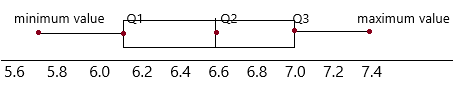
Question 7.
Q1 = 6.1, Q2 = 6.6, Q3 = 7.0, lower extreme value = 5.7, upper extreme value = 7.4
Answer:
A box and whisker plot is a graph that exhibits data from a five-number summary, including one of the measures of central tendency. It does not display the distribution as accurately as a stem and leaf plot or histogram does. But, it is principally used to show whether a distribution is skewed or not and if there are potential unusual observations present in the data set, which are also called outliers. Boxplots are also very useful when huge numbers of data collections are involved or compared. Since the centre, spread and overall range are instantly apparent, using these boxplots the arrangements can be matched easily. A box and whisker plot is a way of compiling a set of data outlined on an interval scale. It is also used for descriptive data interpretation.
Elements of a Box and Whisker Plot:
The elements required to construct a box and whisker plot outliers are given below.
The minimum value (Q0 or 0th percentile)
The first quartile (Q1 or 25th percentile)
Median (Q2 or 50th percentile)
Third quartile (Q3 or 75th percentile)
The maximum value (Q4 or 100th percentile)
– When we plot a graph for the box plot, we outline a box from the first quartile to the third quartile. A vertical line that goes through the box is the median. The whiskers (small lines) go from each quartile towards the minimum or maximum value, as shown in the figure below.
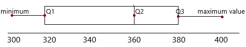
Question 8.
Q1 = 320, Q2 = 360, Q3 = 380, lower extreme value = 300, upper extreme value = 400
Answer:
A box and whisker plot is a graph that exhibits data from a five-number summary, including one of the measures of central tendency. It does not display the distribution as accurately as a stem and leaf plot or histogram does. But, it is principally used to show whether a distribution is skewed or not and if there are potential unusual observations present in the data set, which are also called outliers. Boxplots are also very useful when huge numbers of data collections are involved or compared. Since the centre, spread and overall range are instantly apparent, using these boxplots the arrangements can be matched easily. A box and whisker plot is a way of compiling a set of data outlined on an interval scale. It is also used for descriptive data interpretation.
Elements of a Box and Whisker Plot:
The elements required to construct a box and whisker plot outliers are given below.
The minimum value (Q0 or 0th percentile)
The first quartile (Q1 or 25th percentile)
Median (Q2 or 50th percentile)
Third quartile (Q3 or 75th percentile)
The maximum value (Q4 or 100th percentile)
– When we plot a graph for the box plot, we outline a box from the first quartile to the third quartile. A vertical line that goes through the box is the median. The whiskers (small lines) go from each quartile towards the minimum or maximum value, as shown in the figure below.
Calculate the mean absolute deviation. Round your answers to 3 significant digits when you can.
Question 9.
2, 2, 5, 3, 9, 6,10, 4, 7, 5
Answer:
We begin with the definition of the mean absolute deviation, which is also referred to as the average absolute deviation. It may make more sense to consider this formula as a process, or series of steps, that we can use to obtain our statistic.
1. We start with an average, of a data set, which we will denote by m.
2. Next, we find how much each of the data values deviates from m. This means that we take the difference between each of the data values and m.
3. After this, we take the absolute value of each of the differences from the previous step. In other words, we drop any negative signs for any of the differences. The reason for doing this is that there are positive and negative deviations from m. If we do not figure out a way to eliminate the negative signs, all of the deviations will cancel one another out if we add them together.
4. Now we add together all of these absolute values.
5. Finally, we divide this sum by n, which is the total number of data values. The result is the mean absolute deviation.
The above-given data: 2, 2, 5, 3, 9, 6,10, 4, 7, 5
First find out the Mean:
Mean=sum of observations/number of observations
Mean=2+2+5+3+9+6+10+4+7+5/10
Mean=53/10
Mean=5.3
– Determine the difference between each data value and the mean
|2-5.3|=3.3
|2-5.3|=3.3
|5-5.3|=0.3
|3-5.3|=2.3
|9-5.3|=3.7
|6-5.3|=0.7
|10-5.3|=4.7
|4-5.3|=1.3
|7-5.3|=1.7
|5-5.3|=0.3
– Now, take the absolute value of each obtained difference
The obtained values are 3.3, 3.3, 0.3, 2.3, 3.7, 0.7, 4.7, 1.3, 1.7, 0.3
– Finally, find the mean of these differences
The formula for MAD:
The ratio of the sum of all absolute values of deviation from central measure to the total number of observations.
M.A. D = (Σ Absolute Values of Deviation from Central Measure) / (Total Number of Observations)
MAD=3.3+ 3.3+0.3+ 2.3+ 3.7+0.7+ 4.7+1.3+1.7+0.3/10
MAD=21.6/10
MAD=2.16
Question 10.
58, 62, 45, 39, 40, 60, 67
Answer:
We begin with the definition of the mean absolute deviation, which is also referred to as the average absolute deviation. It may make more sense to consider this formula as a process, or series of steps, that we can use to obtain our statistic.
1. We start with an average, of a data set, which we will denote by m.
2. Next, we find how much each of the data values deviates from m. This means that we take the difference between each of the data values and m.
3. After this, we take the absolute value of each of the differences from the previous step. In other words, we drop any negative signs for any of the differences. The reason for doing this is that there are positive and negative deviations from m. If we do not figure out a way to eliminate the negative signs, all of the deviations will cancel one another out if we add them together.
4. Now we add together all of these absolute values.
5. Finally, we divide this sum by n, which is the total number of data values. The result is the mean absolute deviation.
The above-given data: 58, 62, 45, 39, 40, 60, 67
First find out the Mean:
Mean=58+62+45+39+40+60+67/7
Mean=371/7
Mean=53
– Determine the difference between each data value and the mean
|58-53|=5
|62-53|=9
|45-53|=8
|39-53|=14
|40-53|=13
|60-53|=7
|67-53|=14
– Now, take the absolute value of each obtained difference
The obtained difference values: 5, 9, 8, 14, 13, 7, 14
– Finally, find the mean of these differences
MAD=5+9+8+14+13+7+14/7
MAD=70/7
MAD=7
Question 11.
43.4, 30.5, 20.0, 23.6, 34.5, 36.9, 11.7, 40.2
Answer:
We begin with the definition of the mean absolute deviation, which is also referred to as the average absolute deviation. It may make more sense to consider this formula as a process, or series of steps, that we can use to obtain our statistic.
1. We start with an average, of a data set, which we will denote by m.
2. Next, we find how much each of the data values deviates from m. This means that we take the difference between each of the data values and m.
3. After this, we take the absolute value of each of the differences from the previous step. In other words, we drop any negative signs for any of the differences. The reason for doing this is that there are positive and negative deviations from m. If we do not figure out a way to eliminate the negative signs, all of the deviations will cancel one another out if we add them together.
4. Now we add together all of these absolute values.
5. Finally, we divide this sum by n, which is the total number of data values. The result is the mean absolute deviation.
The above-given data: 43.4, 30.5, 20.0, 23.6, 34.5, 36.9, 11.7, 40.2
First find out the Mean:
Mean=43.4+30.5+20.0+23.6+34.5+36.9+11.7+40.2/8
Mean=240.8/8
Mean=30.1
– Determine the difference between each data value and the mean
|43.4-30.1|=13.3
|30.5-30.1|=0.4
|20.0-30.1|=10.1
|23.6-30.1|=6.5
|34.5-30.1|=4.4
|36.9-30.1|=6.8
|11.7-30.1|=18.4
|40.2-30.1|=10.1
– Now, take the absolute value of each obtained difference
The obtained difference values: 13.3, 0.4, 10.1, 6.5, 4.4, 6.8, 18.4, 10.1
– Finally, find the mean of these differences
MAD=13.3+0.4+10.1+6.5+4.4+6.8+18.4+10.1/8
MAD=70/8
MAD=8.75
Question 12.
1.15, 1.16, 1.25, 1.22, 1.36, 1.38, 1.49, 1.22, 1.11
Answer:
We begin with the definition of the mean absolute deviation, which is also referred to as the average absolute deviation. It may make more sense to consider this formula as a process, or series of steps, that we can use to obtain our statistic.
1. We start with an average, of a data set, which we will denote by m.
2. Next, we find how much each of the data values deviates from m. This means that we take the difference between each of the data values and m.
3. After this, we take the absolute value of each of the differences from the previous step. In other words, we drop any negative signs for any of the differences. The reason for doing this is that there are positive and negative deviations from m. If we do not figure out a way to eliminate the negative signs, all of the deviations will cancel one another out if we add them together.
4. Now we add together all of these absolute values.
5. Finally, we divide this sum by n, which is the total number of data values. The result is the mean absolute deviation.
The above-given data: 1.15, 1.16, 1.25, 1.22, 1.36, 1.38, 1.49, 1.22, 1.11
First find out the Mean:
Mean=1.15+1.16+1.25+1.22+1.36+1.38+1.49+1.22+1.11/9
Mean=11.34/9
Mean=1.26
– Determine the difference between each data value and the mean
|1.15-1.26|=0.11
|1.16-1.26|=0.1
|1.25-1.26|=0.01
|1.22-1.26|=0.04
|1.36-1.26|=0.1
|1.38-1.26|=0.12
|1.49-1.26|=0.23
|1.22-1.26|=0.04
|1.11-1.26|=0.15
– Now, take the absolute value of each obtained difference
The obtained difference values: 0.11, 0.1, 0.01, 0.04, 0.1, 0.12, 0.23, 0.04, 0.15
– Finally, find the mean of these differences
MAD=0.11+0.1+0.01+0.04+0.1+0.12+0.23+0.04+0.15/9
MAD=0.9/9
MAD=0.1
Use the data in the table for the following questions.
The table shows the masses, in grams, of a dozen eggs.

Question 13.
Calculate Q1, Q2, and Q3.
Answer:
The given data: 57, 53, 62, 45, 56, 56, 63, 61, 50, 44, 43, 58
How to calculate quartiles:
1. Order your data set from lowest to highest values
2. Find the median. This is the second quartile Q2.
3. At Q2 split the ordered data set into two halves.
4. The lower quartile Q1 is the median of the lower half of the data.
5. The upper quartile Q3 is the median of the upper half of the data.
Now arrange the data set in ascending order:
43, 44, 45, 50, 53, 56, 56, 57, 58, 61, 62, 63
Now find the median:
Q2=56+56/2
Q2=112/2
Q2=56
Now find Q1: The lower quartile Q1 is the median of the lower half of the data.
Q1 data set: 43, 44, 45, 50, 53, 56
Q1=45+50/2
Q1=95/2
Q1=47.5
Q1 is the median of the lower half of the data.
Now find Q3: The upper quartile Q3 is the median of the upper half of the data.
Q3 data set: 56, 57, 58, 61, 62, 63
Q3=58+61/2
Q3=119/2
Q3=59.5
Q3 is the median of the upper half of the data.
Question 14.
Draw a box plot of the masses of the eggs.
Answer:
the above quartiles we got are
Q1=47.5, Q2=56, Q3=59.5, lower value=43, higher value=63
A box and whisker plot is a graph that exhibits data from a five-number summary, including one of the measures of central tendency. It does not display the distribution as accurately as a stem and leaf plot or histogram does. But, it is principally used to show whether a distribution is skewed or not and if there are potential unusual observations present in the data set, which are also called outliers. Boxplots are also very useful when huge numbers of data collections are involved or compared. Since the centre, spread and overall range are instantly apparent, using these boxplots the arrangements can be matched easily. A box and whisker plot is a way of compiling a set of data outlined on an interval scale. It is also used for descriptive data interpretation.
Elements of a Box and Whisker Plot:
The elements required to construct a box and whisker plot outliers are given below.
The minimum value (Q0 or 0th percentile)
The first quartile (Q1 or 25th percentile)
Median (Q2 or 50th percentile)
Third quartile (Q3 or 75th percentile)
The maximum value (Q4 or 100th percentile)
– When we plot a graph for the box plot, we outline a box from the first quartile to the third quartile. A vertical line that goes through the box is the median. The whiskers (small lines) go from each quartile towards the minimum or maximum value, as shown in the figure below.
Question 15.
Calculate the mean absolute deviation of the masses of the eggs. Round to the nearest hundredth.
Answer:
We begin with the definition of the mean absolute deviation, which is also referred to as the average absolute deviation. It may make more sense to consider this formula as a process, or series of steps, that we can use to obtain our statistic.
1. We start with an average, of a data set, which we will denote by m.
2. Next, we find how much each of the data values deviates from m. This means that we take the difference between each of the data values and m.
3. After this, we take the absolute value of each of the differences from the previous step. In other words, we drop any negative signs for any of the differences. The reason for doing this is that there are positive and negative deviations from m. If we do not figure out a way to eliminate the negative signs, all of the deviations will cancel one another out if we add them together.
4. Now we add together all of these absolute values.
5. Finally, we divide this sum by n, which is the total number of data values. The result is the mean absolute deviation.
The above-given data: 43, 44, 45, 50, 53, 56, 56, 57, 58, 61, 62, 63
First find out the Mean:
Mean=43+44+45+50+53+56+56+57+58+61+61+63/12
Mean=647/12
Mean=53.9
Mean=54 (rounded to nearest number)
– Determine the difference between each data value and the mean
|43-54|=11
|44-54|=10
|45-54|=9
|50-54|=4
|53-54|=1
|56-54|=2
|56-54|=2
|57-54|=3
|58-54|=4
|61-54|=7
|61-54|=7
|63-54|=9
– Now, take the absolute value of each obtained difference
The obtained difference values: 11, 10, 9, 4, 1, 2, 2, 3, 4, 7, 7, 9
– Finally, find the mean of these differences
MAD=11+10+9+4+1+2+2+3+4+7+7+9/12
MAD=69/12
MAD=5.75
Use the information to answer the following questions.
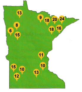
The map shows the amounts of snow, in inches, that fell in different parts of Minnesota during one week in winter.
Question 16.
Calculate Q1, Q2, and Q3.
Answer:
The given data: 13, 6, 8, 15, 9, 18, 18, 20, 24, 16, 11, 10, 13, 15, 10, 12
How to calculate quartiles:
1. Order your data set from lowest to highest values
2. Find the median. This is the second quartile Q2.
3. At Q2 split the ordered data set into two halves.
4. The lower quartile Q1 is the median of the lower half of the data.
5. The upper quartile Q3 is the median of the upper half of the data.
Now arrange the data set in ascending order:
6, 8, 9, 10, 10, 11, 12, 13, 13, 15, 15, 16, 18, 18, 20, 24
Now find the median:
Q2=13+13/2
Q2=26/2
Q2=13
Now find Q1: The lower quartile Q1 is the median of the lower half of the data.
Q1 data set: 6, 8, 9, 10, 10, 11, 12, 13
Q1=10+10/2
Q1=20/2
Q1=10
Q1 is the median of the lower half of the data.
Now find Q3: The upper quartile Q3 is the median of the upper half of the data.
Q3 data set: 13, 15, 15, 16, 18, 18, 20, 24
Q3=16+18/2
Q3=34/2
Q3=17
Q3 is the median of the upper half of the data.
Question 17.
Draw a box plot of the snow amounts.
Answer:
the above quartiles we got are:
Q1=10, Q2=13, Q3=17, lowest value=6, highest value=24
A box and whisker plot is a graph that exhibits data from a five-number summary, including one of the measures of central tendency. It does not display the distribution as accurately as a stem and leaf plot or histogram does. But, it is principally used to show whether a distribution is skewed or not and if there are potential unusual observations present in the data set, which are also called outliers. Boxplots are also very useful when huge numbers of data collections are involved or compared. Since the centre, spread and overall range are instantly apparent, using these boxplots the arrangements can be matched easily. A box and whisker plot is a way of compiling a set of data outlined on an interval scale. It is also used for descriptive data interpretation.
Elements of a Box and Whisker Plot:
The elements required to construct a box and whisker plot outliers are given below.
The minimum value (Q0 or 0th percentile)
The first quartile (Q1 or 25th percentile)
Median (Q2 or 50th percentile)
Third quartile (Q3 or 75th percentile)
The maximum value (Q4 or 100th percentile)
– When we plot a graph for the box plot, we outline a box from the first quartile to the third quartile. A vertical line that goes through the box is the median. The whiskers (small lines) go from each quartile towards the minimum or maximum value, as shown in the figure below.
Question 18.
Calculate the mean absolute deviation of the snow amounts. Round your answer to the nearest inch.
Answer:
We begin with the definition of the mean absolute deviation, which is also referred to as the average absolute deviation. It may make more sense to consider this formula as a process, or series of steps, that we can use to obtain our statistic.
1. We start with an average, of a data set, which we will denote by m.
2. Next, we find how much each of the data values deviates from m. This means that we take the difference between each of the data values and m.
3. After this, we take the absolute value of each of the differences from the previous step. In other words, we drop any negative signs for any of the differences. The reason for doing this is that there are positive and negative deviations from m. If we do not figure out a way to eliminate the negative signs, all of the deviations will cancel one another out if we add them together.
4. Now we add together all of these absolute values.
5. Finally, we divide this sum by n, which is the total number of data values. The result is the mean absolute deviation.
The above-given data:
First find out the Mean: 6, 8, 9, 10, 10, 11, 12, 13, 13, 15, 15, 16, 18, 18, 20, 24
Mean=sum of observations/number of observations
Mean=6+8+9+10+10+11+12+13+13+15+15+16+18+18+20+24/16
Mean=218/16
Mean=13.265
Mean=14(nearest inch)
– Determine the difference between each data value and the mean
|6-14|=8
|8-14|=6
|9-14|=5
|10-14|=4
|10-14|=4
|11-14|=3
|12-14|=2
|13-14|=1
|13-14|=1
|15-14|=1
|15-14|=1
|16-14|=2
|18-14|=4
|18-14|=4
|20-14|=6
|24-14|=10
– Now, take the absolute value of each obtained difference
The obtained values are 8, 6, 6, 4, 4, 3, 2, 1, 1, 1, 1, 2, 4, 4, 6, 10
– Finally, find the mean of these differences
The formula for MAD:
The ratio of the sum of all absolute values of deviation from central measure to the total number of observations.
M.A. D = (Σ Absolute Values of Deviation from Central Measure) / (Total Number of Observations)
MAD=8+6+6+4+4+3+2+1+1+1+1+2+4+4+6+10/16
MAD=53/16
MAD=3.3
Use the data in the table for questions 19 and 20.
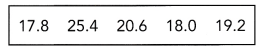
The table shows the heights, in centimeters, of 5 peanut plants.
Question 19.
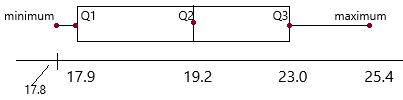
Draw a box plot of the heights of the peanut plants.
Answer:
The given data: 17.8, 25.4, 20.6, 18.0, 19.2
A box and whisker plot is a graph that exhibits data from a five-number summary, including one of the measures of central tendency. It does not display the distribution as accurately as a stem and leaf plot or histogram does. But, it is principally used to show whether a distribution is skewed or not and if there are potential unusual observations present in the data set, which are also called outliers. Boxplots are also very useful when huge numbers of data collections are involved or compared. Since the centre, spread and overall range are instantly apparent, using these boxplots the arrangements can be matched easily. A box and whisker plot is a way of compiling a set of data outlined on an interval scale. It is also used for descriptive data interpretation.
Elements of a Box and Whisker Plot:
The elements required to construct a box and whisker plot outliers are given below.
The minimum value (Q0 or 0th percentile)
The first quartile (Q1 or 25th percentile)
Median (Q2 or 50th percentile)
Third quartile (Q3 or 75th percentile)
The maximum value (Q4 or 100th percentile)
– When we plot a graph for the box plot, we outline a box from the first quartile to the third quartile. A vertical line that goes through the box is the median. The whiskers (small lines) go from each quartile towards the minimum or maximum value, as shown in the figure below.
Question 20.
Calculate the mean absolute deviation of the heights of the peanut plants.
Answer:
We begin with the definition of the mean absolute deviation, which is also referred to as the average absolute deviation. It may make more sense to consider this formula as a process, or series of steps, that we can use to obtain our statistic.
1. We start with an average, of a data set, which we will denote by m.
2. Next, we find how much each of the data values deviates from m. This means that we take the difference between each of the data values and m.
3. After this, we take the absolute value of each of the differences from the previous step. In other words, we drop any negative signs for any of the differences. The reason for doing this is that there are positive and negative deviations from m. If we do not figure out a way to eliminate the negative signs, all of the deviations will cancel one another out if we add them together.
4. Now we add together all of these absolute values.
5. Finally, we divide this sum by n, which is the total number of data values. The result is the mean absolute deviation.
The above-given data:
First find out the Mean: The given data: 17.8, 25.4, 20.6, 18.0, 19.2
Mean=sum of observations/number of observations
Mean=17.8+25.4+20.6+18.0+19.2/5
Mean=101/5
Mean=20.2
– Determine the difference between each data value and the mean
|17.8-20.2|=2.4
|25.4-20.2|=5.2
|20.6-20.2|=0.4
|18.0-20.2|=2.2
|19.2-20.2|=1
– Now, take the absolute value of each obtained difference
The obtained values are 2.4+5.2+0.4+2.2+1
– Finally, find the mean of these differences
The formula for MAD:
The ratio of the sum of all absolute values of deviation from central measure to the total number of observations.
M.A. D = (Σ Absolute Values of Deviation from Central Measure) / (Total Number of Observations)
MAD=2.4+5.2+0.4+2.2+1/5
MAD=11.2/5
MAD=2.24
Solve.
Question 21.
Math journal Compare the box plot and the mean absolute deviation. Which one is a better measure of variation? State your reason.
Answer:
Mean absolute deviation is a better measure of variation. A box plot is not meaningful with only 5 data values.
Question 22.
Math Journal Describe a situation for which you think a box plot would be useful for measuring variation.
Answer:
You need to have information on the variability or dispersion of the data. A boxplot is a graph that gives you a good indication of how the values in the data are spread out. Although boxplots may seem primitive in comparison to a histogram or density plot, they have the advantage of taking up less space, which is useful when comparing distributions between many groups or datasets.
Question 23.
Math journal Describe a situation for which you think the mean absolute deviation would be useful for measuring variation.
Answer:
the mean absolute deviation is most useful when you are interested in how data are spread from the mean.