This handy Math in Focus Grade 6 Workbook Answer Key Chapter 13 Lesson 13.2 Dot Plots detailed solutions for the textbook questions.
Math in Focus Grade 6 Course 1 B Chapter 13 Lesson 13.2 Answer Key Dot Plots
Math in Focus Grade 6 Chapter 13 Lesson 13.2 Guided Practice Answer Key
Math in Focus Course 1B Practice 13.2 Answer Key
Question 1.
A group of 15 students was asked how many times they have traveled on a plane. The results are recorded in the table.
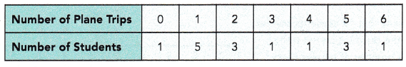
Answer:
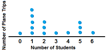
Explanation:
A dot plot is a graphical display of data using dots.
In a dot plot, data points (dots) are stacked in a column over a category.
The height of the column represents the frequency of observations in a given category.
These graphs stack dots along the horizontal X-axis to represent the frequencies of values.
More dots indicate greater frequency.
Each dot represents a set number of observations.
Title the dot plot based on the problem.
Question 2.
The results of the high jumps at a track meet are recorded in the table.
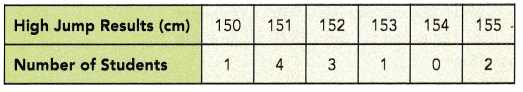
Answer:
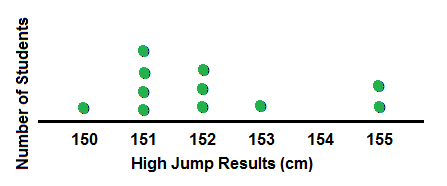
Explanation:
A dot plot is a graphical display of data using dots.
In a dot plot, data points (dots) are stacked in a column over a category.
The height of the column represents the frequency of observations in a given category.
These graphs stack dots along the horizontal X-axis to represent the frequencies of values.
More dots indicate greater frequency.
Each dot represents a set number of observations.
Title the dot plot based on the problem.
Describe the data.
Question 3.
The weekly savings (in dollars) of 10 students in a class are shown in the dot plot. Briefly describe the distribution of the weekly savings of the students.
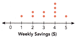
Answer:
Explanation:
Given that, the weekly savings (in dollars) of 10 students in a class are shown in the dot plot.
So, there are 10 students in the class as per the dots on the dot plot.
The distribution of the weekly savings of the students are:
$0 weekly savings = 0 students
$1 weekly savings = 1 student
$2 weekly savings = 2 students
$3 weekly savings = 2 students
$4 weekly savings = 4 students
$5 weekly savings = 1 student
Question 4.
The number of points scored by 12 members of a volleyball team in a game is shown in the dot plot. Briefly describe the number of points scored by the group of players.
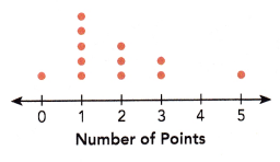
Answer:
Explanation:
Given that, The number of points scored by 12 members of a volleyball team in a game is shown in the above dot plot.
So, there are 12 members of a volleyball team in a game.
The different players scored different points are listed on the above table.
Hands-On Activity
CONSTRUCTING A DISTRIBUTION
Materials:
- 2 number cubes, numbered 1-6
- blank table
Work in pairs.
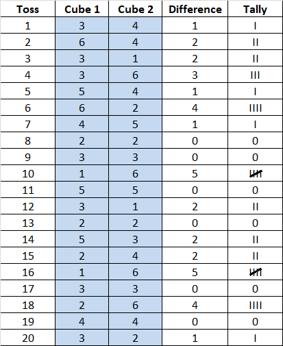
Step 1: Toss two number cubes. Record the difference between the two numbers in a tally chart.
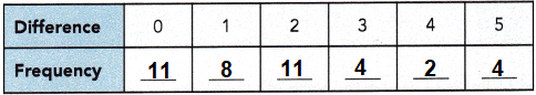
Step 2: Repeat 20 times and add your results to another group’s results. Record the results for 40 tosses in a copy of the table below.
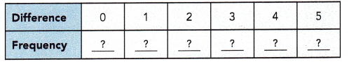
Step 3: Represent the data with a dot plot.
Step 4: Repeat Step 1 to Step 3, but record the SUM of the two numbers each time.
Answer:
Step 1: Toss two number cubes. Record the difference between the two numbers in a tally chart.
![]()
Step 2: Repeat 20 times and add your results to another group’s results.
Record the results for 40 tosses in a copy of the table below.
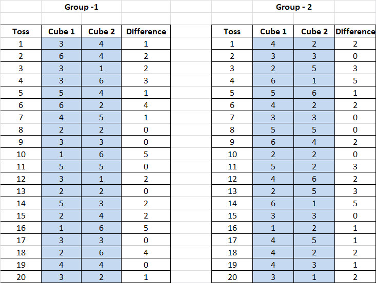
the results for 40 tosses in a copy of the table below.
Represent the data with a dot plot.
a) What is the least sum you can get?
Answer:
2
Explanation:
Toss two number cubes and record the difference between the two numbers in a tally chart,
ass shown above.
Repeat 20 times and add results to another group’s results.
Record the results for 40 tosses.
So, the lest sum we get after tossing is only 2 times of 4 number toss recorded after 40 experiments.
b) What is the greatest sum you can get?
Answer:
11
Explanation:
Toss two number cubes and record the difference between the two numbers in a tally chart,
ass shown above.
Repeat 20 times and add results to another group’s results.
Record the results for 40 tosses.
The difference between the two cubes is 0 and 2 are 11 times 4 number toss recorded after 40 experiments.
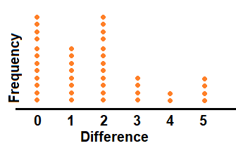
Math journal
a) Describe the distribution of the differences.
Answer:
The Sampling Distribution of the Difference between two Means shows the distribution of means of two samples drawn from the two independent populations, such that the difference between the population means can possibly be evaluated by the difference between the sample means.
Explanation:
To find the distribution of the differences between two numbers,
subtract the number with the smallest value from the number with the largest value.
The product of this sum is the difference between the two numbers.
for example; the difference between 45 and 100 is 55.
b) Describe the distribution of the sums.
Answer:
We can form new distributions by combining random variables.
If we know the mean and standard deviation of the original distributions,
we can use that information to find the mean and standard deviation of the resulting distribution.
Explanation:
So, the normal distribution has a mean equal to the original mean multiplied by the sample size and a standard deviation.
c) Discuss with your partner why one distribution is skewed, and the other is symmetric (or nearly so). Why are the shapes of the two distributions different?
Answer:
In a symmetrical distribution the two sides of the distribution are a mirror image of each other.
Explanation:
A distribution of data item values may be symmetrical or asymmetrical.
Two common examples of symmetry and asymmetry are the normal distribution and the skewed distribution.
In a symmetrical distribution the two sides of the distribution are a mirror image of each other.
Math in Focus Course 1B Practice 13.2 Answer Key
Represent each set of data with a dot plot.
Question 1.
The years of service for each of the 18 employees in a company are as follows:
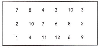
Answer:
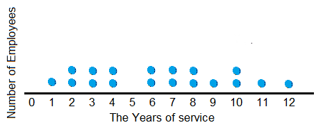
Explanation:
A dot plot is a graphical display of data using dots.
In a dot plot, data points (dots) are stacked in a column over a category.
The height of the column represents the frequency of observations in a given category.
These graphs stack dots along the horizontal X-axis to represent the frequencies of values.
More dots indicate greater frequency.
Each dot represents a set number of observations.
Title the dot plot based on the problem.
Dot plot drawn with the data given in the table,
as years of service for each of the 18 employees in a company.
Each data is one employee, there are total 18 employees.
Question 2.
A group of 24 students was asked how many states they have visited. The results are recorded in the table.
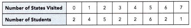
Answer:
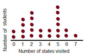
Explanation:
A dot plot is a graphical display of data using dots.
In a dot plot, data points (dots) are stacked in a column over a category.
The height of the column represents the frequency of observations in a given category.
These graphs stack dots along the horizontal X-axis to represent the frequencies of values.
More dots indicate greater frequency.
Each dot represents a set number of observations.
Title the dot plot based on the problem.
Dot plot drawn with the data given in the table,
a group of 24 students was asked how many states they have visited.
A group of teens was asked to indicate how many pairs of shoes they have in their closet. The results are shown in the dot plot. Use the dot plot to answer questions 3 to 5.
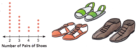
Question 3.
How many data values are there?
Answer:
2 data values.
Explanation:
Number of pairs of shoes and Number of teens.
Question 4.
What conclusions can you draw with regard to the number of pairs of shoes the teens have?
Answer:
More number of teens have 2 pairs of shoes.
Explanation:
As per the dot plot more dots or more teens are marked in orange who consists 2 pairs of shoes.
The conclusion is more number of teens have 2 pairs of shoes.
Question 5.
What percent of the teens indicated 3 pairs of shoes in their closet?
Answer:
25%
Explanation:
Total number of teens are 20.
The teens who indicated 3 pairs of shoes are 5.
5/20 = 0.25
0.25 X 100 =25%
The dot plot shows the number of weeks each movie that was number 1 at the box office during one year stayed in the number 1 position. Use the dot plot to answer questions 6 and 7.
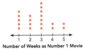
Question 6.
How many movies are represented by the dots altogether?
Answer:
20 movies.
Explanation:
In the above dot plot, total 20 dots present,
it means 20 movies are represented by the dots altogether.
Question 7.
Give a reason why more dots are above the numbers 1 to 3 than above the numbers 4 and 5 on the horizontal axis.
Answer:
More dots on plot shows the number of weeks each movie that was number 1 at the box office during one year stayed in the number 1 position between the numbers 1 to 3 than above the numbers 4 and 5 on the horizontal axis.
Explanation:
A dot plot is a graphical display of data using dots.
In a dot plot, data points (dots) are stacked in a column over a category.
The height of the column represents the frequency of observations in a given category.
These graphs stack dots along the horizontal X-axis to represent the frequencies of values.
More dots indicate greater frequency.
Each dot represents a set number of observations.
Title the dot plot based on the problem.
Copy and complete the dot plot. Use the dot plot to answer each question.
Question 8.
The incomplete dot plot shows the result of a survey in which each student was asked how many dimes were in their pockets or wallets. The results for “4 dimes” are not shown. Each dot represents one student. It is known that 12.5% of the students had one dime.
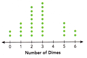
a) Find the number of students surveyed. Then complete the dot plot.
Answer:
32 students were surveyed.
So, dots for 4 dimes is 3.
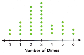
Explanation:
let x be the number of students surveyed,
If 12.5% of the students had one dime,
then, 0.125x = students had one dime.
From the dot plot, 4 students had one dime.
So, 0.125x = 4
Dividing both sides by 0.125 gives,
x= 4/0.125
x = 32
Therefore 32 students were surveyed.
Counting the total number of dots in the incomplete dot plot gives:
2 + 4 + 8 + 9 + 4 + 2 = 29
Hence there must be 32 dots in all to represent all 32 of the students.
Then there should be
32 − 29 = 3
dots for “4 dimes” are 3.
b) What percent of the students had either 0 or 6 dimes?
Answer:
6.25% students have 0 or 6 dimes in their pocket.
Explanation:
Total dots = 32
percent of the students had either 0 or 6 dimes,
2 students have either 0 or 6 dimes in their pocket.
2/32 = 0.625
0.625 x 100 = 6.25%
c) What percent of the students had either 1 or 5 dimes?
Answer:
12.5% students have 1 or 5 dimes in their pocket.
Explanation:
Total dots = 32
percent of the students had either 1 or 5 dimes,
4 students have either 1 or 5 dimes in their pocket.
4/32 = 0.125
0.125 x 100 = 12.5%
d) Briefly describe the distribution of the data.

Answer:
The distribution of the data given in the dot plot is number of students and the number of dimes in their pocket.
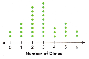
Explanation:
The distribution of the data given in the dot plot is number of students and the number of dimes in their pocket.
2 students have no dimes in their pocket.
4 students have 1 dime in their pocket.
8 students have 2 dimes in their pocket.
9 students have 3 dimes in their pocket.
4 students have 4 dimes in their pocket.
5 students have 5 dimes in their pocket.
2 students have 6 dimes in their pocket.